MEGAPUTER

Client

Megaputer
Role & Duration
User researcher, UI Designer, Design system
10 months
Impact
95%
Adoption rate
35
Addressed usability issues
9/10
Users said they prefer re-vamped websie
88%
Easier to find content
Overview of the Company
Megaputer is an online website/platform that has been developing data and text mining software since 1993. Their mission is to provide customers with analytical tools and solutions that both deliver results and are easy to use.
Problem space
-
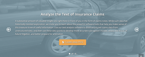
Usability limitations: The website’s complicated layout and inconsistent design make it hard for users to find the information they need
-
Weak brand representation: The website lacks a consistent look and feel, making it difficult for Megaputer to clearly communicate its brand message.
-
Engagement issues: The website does not grab users' attention or encourage them to explore Megaputer’s solutions, reducing potential leads.
Design Process
Data Analysis
Research(Primary, secondary, market research)
Ideation &conceptualization
Testing & Iteration
Design& Development
RESEARCH
1. Competitive analysis
After analyzing 20+ competitors, we gained insights into how companies showcase their data analytics products. We examined core features like data integration, visualization, machine learning, and NLP.
Customer feedback highlighted strengths such as powerful technology and user-friendliness, alongside drawbacks like limited free options and a steep learning curve.
Website analysis revealed clear navigation and relevant content but also issues like information overload and missing error messages.

From semrush.com we analyzed that we need to increase our SEO,target niche keywords, and improve content relevance

2. Interviews & Think a-loud
From 10+ interviews & 2+ Think a-louds, there were 4 focus areas users wanted-
Product Requirements
-
Clear product goals
-
Unique feature differentiation
-
Transparent pricing structure
-
Comprehensive documentation
Purchase decisions
-
Scalability potential
-
Return on investment
-
Total cost of ownership
-
Organizational alignment
Trust Builders
-
Interactive product demos
-
Strong brand reputation
-
Immediate support availability
-
AI chatbot integration
User Experience
-
Intuitive user interface
-
Clear navigation paths
-
Security certifications
-
Verified customer reviews
3. Data collection from company
We circulated a questionnaire consisting of a couple of questions relating to the company itself. Our aim was to understand the company from the perspective of people who have worked there all this while.
The questions helped us understand what the company is doing better, what their key differentiators are, what user experience and interface challenges they have faced, and their recommendations for us to redesign. It also helped us figure out what are a few strong points they currently have and what they want completely changed on the website.
Survey Questionnaire link - https://forms.gle/sZKzEtDqmwzgFpX19


IDEATION & CONCEPTUALIZATION

Text overload and redundancy
Text overload and redundancy

Unrelated texts and images
Primary CTA looks disabled

No services provided mentioned in home screen

Confusing layouts
Product description in paragraphs, increasing bounce rates


Inconsistent CTA'S
Information Architecture
Inconsistent CTA's

More than 150 + categories
Brainstorming & Ideation
We conducted card sorting to streamline the extensive Solutions page, optimizing link structures and reorganizing content for better navigation and discoverability.


DESIGN
Initial sketches


Low-fidelity


Golden flow
We ideated on improving emphasis on key tasks which were being ignored.

Design System


Hi-fidelity


Refined header and logo
Designated CTA's
Display of trusted clients ensuring trust
Organized company offerings
Clear differentiator amongst competitors
One liner tagline that explains megaputer's purpose
Glimpse of product offerings

Detailed solution page with tabs that explain about it
Added breadcrumbs across website to let user know where they are in website
Reduced solution categories from 35 to 21 and pages from 127 to 50

Merged/Deleted and made single page for similar categories
Data in consumable format
USABILITY TESTING

Old flow- 1min 18sec

Attention to man and lion instead of tagline

New flow- 30 sec

Attention to tagline, Clients, CTA and company offerings
Evaluation results
Tested prototype with over 10+ users
-
Users/clients appreciated design is visually modern
-
Tags marks content within solutions, making navigation easier.
-
clear home page
-
9/10 users said they would use new website
LEARNING
Throughout the process of redesigning Megaputer’s website, I gained valuable insights and skills. From conducting in-depth research to spending countless hours brainstorming with my teammates, this journey was both intense and rewarding. I dedicated nights to designing, refining ideas, and developing a comprehensive design system while building reusable components.
Receiving constructive feedback from the client and iterating on the design based on their input was a crucial learning experience. Over the span of 11 months, I collaborated closely with the client—researching, brainstorming, and building screens. Finally seeing the completed design come to life was an incredibly fulfilling moment.